Sunday, March 30, 2014

Up In The Sky

Up In The Sky

 is the challenge (#118)  this week at

 FOSTV (Friends of Speedy TV)  at

 Marks' Finest Papers and Stamps.


I've used the Lots of Words 2013 stamp set today for my DT card.


Challenge Winner Guidelines
We encourage you to participate in all of our challenges.
Please limit your submissions to 5 per challenge, per week.

Each submission needs to be a new card (no cards that have been posted prior to the challenge date).

Please do not submit the same card for every challenge, each submission should be a different card for each submission and each  challenge.
This challenge posts every Monday by 8 AM. (It could be earlier!)

Wednesday, March 26, 2014

Color Challenge 16 - Burgundy and Grey

at Mark's Finest Papers and Stamps.


I used one of the sentiments from the Presents 2013 Stamp Set for this card.  
It is one of my most used sentiments. 
 I just love it!!!!


Here is my little photo tutorial for you this week.  


Color Challenge 16
This Challenge is  for all types of paper crafts, including scrapbook pages.  Each week we will have a color or colors that you have to incorporate in your project, and of course, you must use stamp(s) on the project.

This week's colors are Burgundy and Grey. You may use any neutral colors.


The guidelines for the Color Challenge are...
1.  Use the challenge colors as your main colors.  You can use any shades or hues of the challenge colors.

2.  You can add any neutral colors (browns, grays, black, white, cream, kraft etc) that you wish.

3. You can use an accent color in addition to the challenge colors,  but it must be an accent only and not one of the main colors in your project.

4. You must use stamps on your project.  

Remember your can create any type of project you want for this challenge but you must use stamp(s) on your project. They don't have to be Mark's Finest Papers, a Heinrich Co stamps but if you do use MFPaHC stamps,  you will be entered twice for a chance to win our weekly stamp prize. 

Sunday, March 23, 2014

There is a saying that goes something like this:
"It's hard to remember that your initial objective is to drain the swamp when you are elbow deep in alligators"

It's working quite like this for me lately - let me explain...
I've got some "issues" in my life right now (doesn't everyone), and I've been somewhat preoccupied with my thoughts of these issues while creating my DT cards the past few months.  
This week is obviously NO EXCEPTION - 


So I'm working away at this card, loving the colors, really getting into making this cute little hydrangea with my new Martha Stewart punch,  I finish the card, quite happy with the results when I suddenly realize that the objective was TO USE AT LEAST 3 BRADS

Lesson Learned:  the card is MUCH nicer when you add the embellishments in the correct order (see photo of how I "tried" to "fix" the problem instead of starting over on this card.
Guess this one will stay in my stash for awhile and not get sent out.

Other Lesson Learned:  Keep the objective in mind while doing the job at hand.


I used the awesome Friends 2014 Stamp Set from Mark's Finest Papers and Stamps for this card which you can purchase here.


Here is my little mini photo tutorial of some of the steps I took making this card.


Please check out the challenge rules and don't forget to link up your cards to Speedy TV and the Friends of Speedy TV challenge.
We have many other challenges here on Speedy TV and you may want to check those out too!
Please link up your FOSTV117 entries by 3pm on Sunday 

Thursday, March 20, 2014

Spring Colors

 is the Challenge (#15)
this week at
 Mark's Finest Papers and Stamps Color Challenge


We don't really have a Spring here in south central Florida, not like the tulips, daffodils, hyacinths and crocus popping up through the soil, or the pussy willows and crab apple trees budding which I remember so fondly of growing up in upstate New York 


 But these adorable yellow and blues make me feel like "Spring" today!   


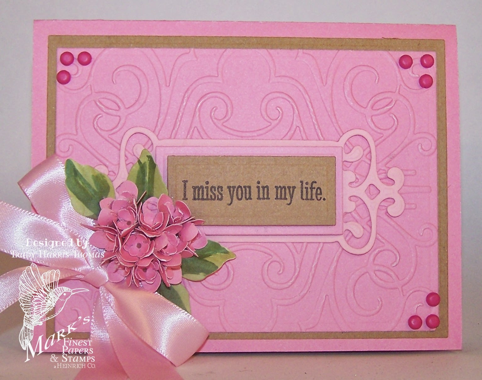
This is an A2 card (5 1/2" x 4 1/4").  I


The sentiment was stamped with Black ColorBox Pigment Ink Pad


The butterfly from the Lots of Words 2013 was heat embossed (on watercolor paper) and colored with watercolor pencils and sprayed with Goosebumps for some texture and shine

All the flowers were cut using a Cricut George and Basic Shapes cartridge, moulded on a mouse pad and attached with glue dots.  Irock gems were heat sealed in the center of the flowers


The guidelines for the Color Challenge are...
1.  Use the challenge colors as your main colors.  You can use any shades or hues of the challenge colors.

2.  You can add any neutral colors (browns, grays, black, white, cream, kraft etc) that you wish.  

3. You can use an accent color in addition to the challenge colors,  but it must be an accent only and not one of the main colors in your project.

4. You must use stamps on your project.   

Remember your can create any type of project you want for this challenge but you must use stamp(s) on your project. They don't have to be Mark's Finest Papers, a Heinrich Co stamps but if you do use MFPaHC stamps,  you will be entered twice for a chance to win our weekly stamp prize. 


Sunday, March 16, 2014

These Are The Moments I Live For


I've used the Ephemera Sampler #2 - Motherly Love, a mix sampler of ephemera, sentiments, tags and other little bits that can make your card or project special. 


No element on this sampler mix is bigger than 4"x4" Prints perfectly on 8.5x11 on regular cardstock. It's a lovely sampler with beautiful colors.


 I enlarged the "post card" on my printer so that I could use it as my background and then just mounted the sentiment and the card to black cardstock, added some ink distressing, lace, ribbon and bling. 


Altered Box Challenge at FOSTV


This is my first altered box and I will certainly change things up a bit for my next one, that's for sure.


 Since beginning on the paper crafting journey just last year, I have made it a point to share my mistakes and lack of coordination with you, and learning in the process that "it's only paper - throw it away/put it in the scrap pile" and try something different.  


This week is no exception!


  • Mistakes #1 and #2 - This was a "padded satin box" from Dollar Tree.  Padded and Satin mean exactly THAT - it is very difficult to get other mediums to adhere to it (i.e. - STUFF WON'T STICK)  and padded mean's that it MOVES when you are trying to work on it.


  •  Mistake #3 - Don't try to use the hot glue gun for everything when doing altered art, especially if you can't control the flow of glue. It shows.


  • Mistake #4 - Avoid "playing" with the editor and all the effects in Photoscape when you have absolutely no idea HOW to use the thing properly.  Seems I'm so busy making stuff that I don't bother to ready any of the instructions (and that includes new tools in the studio).  


Please check out the challenge rules and don't forget to link up your cards to Speedy TV and the Friends of Speedy TV challenge.
We have many other challenges here on Speedy TV and you may want to check those out too!
Please link up your FOSTV entries by 3pm on Sunday 

You could be the owner of this stamp set if your entry is chosen the winner of the challenge


Wishing you a beautiful and blessed week.
Trudy